
Customer Segmentation Analysis
In this example, we are going to conduct a simple customer segmentation analysis using K-Means algorithm. The data is about the customers of a shopping mall, which includes basic information on Customer ID, age, gender, annual income (in thousands) and spending score, where spending score is assigned by the company based on historical information.
import numpy as np
import pandas as pd
import matplotlib.pyplot as plt
import seaborn as sns
plt.style.use('ggplot')

df_mall = pd.read_csv('mall_customers.csv')
df_mall.head()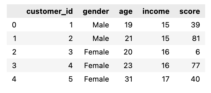
Explore the pair plot to see any potential clusters:
Make sure you use seaborn 0.12.2 version or above:
uv add seaborn
# try to get same sense on the clusters
# look at the age-income-score pair plot

sns.pairplot(df_mall[['age', 'income', 'score']])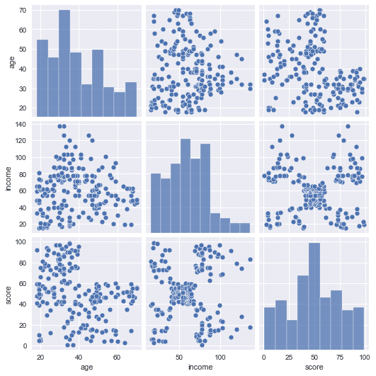
Income and score seem to lead to 5 clusters. Any patterns in each cluster for gender?
# dig deeper for spending score and income with gender
# s=100 size, alpha=0.5 opacity
sns.scatterplot(data=df_mall, x='income', y='score', hue='gender', s=100, alpha=0.5)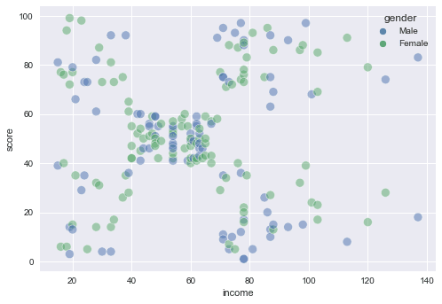
Income and score seem to lead to 5 clusters. Any patterns in each cluster for Age?
# dig deeper for score and income with age
sns.scatterplot(data=df_mall, x='income', y='score', hue='age', s=100, alpha=0.5)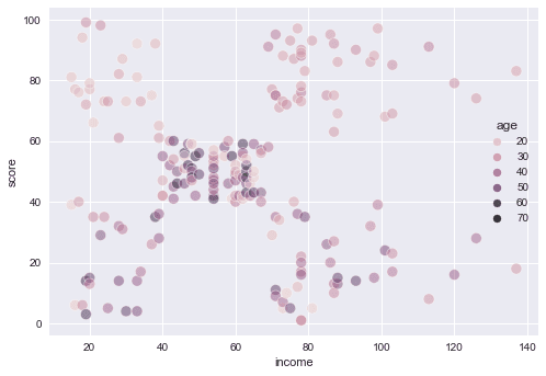
2D Clustering
In this section, we choose two features (2D) to cluster the data and plot the result as a Voronoi Diagram.
# Use Annual Income and Spending Score to do 2D Kmeans Clustering
from sklearn.cluster import KMeans
from sklearn.metrics import silhouette_score

df_2d = df_mall[['income', 'score']]

inertia_scores = []
silhouette_scores = []

# try 9 different k values
# note that we have to start with 2 clusters for the silhouette score to work
for k in range(2, 11):
    kmeans = KMeans(n_clusters=k, random_state=42)
    kmeans.fit(df_2d)
    silhouette_scores.append(silhouette_score(df_2d, kmeans.labels_)) # record the silhouette score for each k
    inertia_scores.append(kmeans.inertia_) # record the inertia for each k

# plot the inertia scores
fig, ax = plt.subplots(figsize=(15, 5))
k = np.arange(2, 11)
ax.plot(k, inertia_scores, 'o')  # draw the dots
ax.plot(k, inertia_scores, '-')  # draw the lines
ax.set_xlabel('Number of Clusters: k')
ax.set_ylabel('Inertia')

# plot the silhouette scores
fig, ax = plt.subplots(figsize=(15, 5))
k = np.arange(2, 11)
ax.plot(k, silhouette_scores, 'o')  # draw the dots
ax.plot(k, silhouette_scores, '-')  # draw the lines
ax.set_xlabel('Number of Clusters: k')
ax.set_ylabel('Silhouette scores')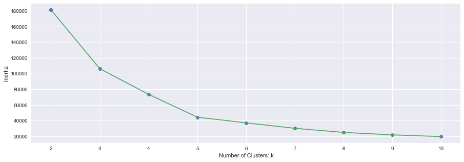
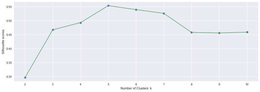
Choose k=5 according to the plots above and we train a k-means model again so that we can plot the Voronoi Diagrams of the clusters:
# choose k=5 to run k-means again
kmeans = KMeans(n_clusters=5, random_state=42)
kmeans.fit(df_2d)

# labels indicates which cluster a data instance belongs to
labels = kmeans.labels_
centroids = kmeans.cluster_centers_

# plot the Voronoi Diagram of the clusters

# find the min and max of income to set the plot x range
x_min = df_2d['income'].min() - 1
x_max = df_2d['income'].max() + 1

# find the min and max of score to set the plot x range
y_min = df_2d['score'].min() - 1
y_max = df_2d['score'].max() + 1

# x, y values with step 0.02
# step: the smaller the number the smoother the cluster boundaries
step = 0.02
x_values = np.arange(x_min, x_max, step);
y_values = np.arange(y_min, y_max, step);

# generate a grid of x y
xx, yy = np.meshgrid(x_values, y_values)

# change step to 20 you can try to plot the grid
#fig, ax = plt.subplots()
#ax.plot(xx, yy, 'o')

# when step =0.02 we are generating a huge grid of x and y
# then we predict the cluster for each of the point on the grid into C
# reshape C it back to the shape of the grid
# note: ravel() flattens an array and np.c_ concatenates arrays along the second axis

C = kmeans.predict(np.c_[xx.ravel(), yy.ravel()])
C = C.reshape(xx.shape)

fig, ax = plt.subplots(figsize=(15, 8))
# plt.imshow displays data as an image, which shows the "clusters"
# specify the bounding box coordinates that the image will fill
left = xx.min()-1
right = xx.max()+1
bottom = yy.min()-1
top = yy.max()+1

# cmap is the color map - we choose a light color map
ax.imshow(C, extent=(left, right, bottom, top), aspect='auto', cmap=plt.cm.Pastel2)

# plot the points and color is the cluster label
ax.scatter(x='income', y='score', data=df_mall, c=labels, s=200, alpha=0.9)

# plot the centroids as triangles
ax.scatter(x=centroids[:,0], y=centroids[:,1], s=300, c='blue', marker='^', alpha=0.6)
ax.set_xlabel('Annual Income (k$)')
ax.set_ylabel('Spending Score')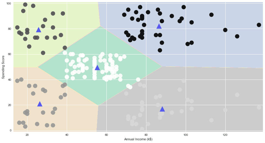
3D Clustering
Next, we choose three features (3D) to cluster the data and plot the result in 3D using plotly package, which you need to install using uv add plotly
# Use Annual Income, Spending Score, and Age
from sklearn.cluster import KMeans

df_3d = df_mall[['income', 'age', 'score']]

inertia = []

# try 10 different k values
for k in range(1, 11):
    kmeans = KMeans(n_clusters=k, random_state=42)
    kmeans.fit(df_3d)
    inertia.append(kmeans.inertia_) # record the inertia for each k

# plot the inertia
fig, ax = plt.subplots(figsize=(15, 5))
k = np.arange(1, 11)
ax.plot(k, inertia, 'o')
ax.plot(k, inertia, '-')
ax.set_xlabel('Number of Clusters: k')
ax.set_ylabel('Inertia')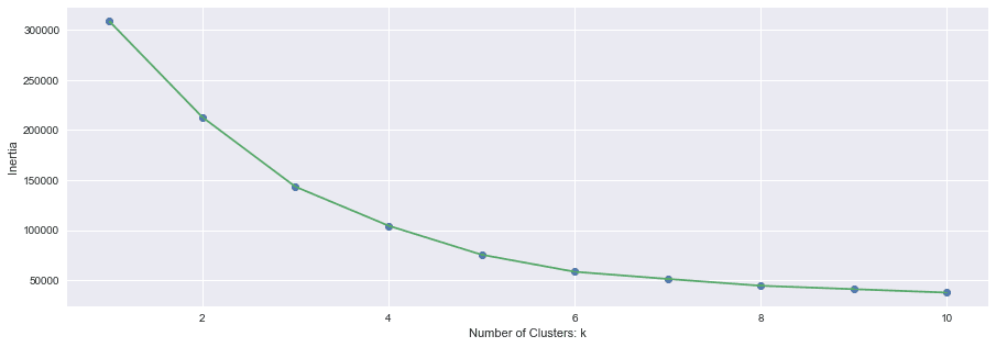
# choose k=6 to run k-means again
kmeans = KMeans(n_clusters=6, random_state=42)
kmeans.fit(df_3d)

# labels indicates which cluster a data instance belongs to
labels = kmeans.labels_
df_mall['cluster'] =  labels  # create a new column for ClusterID
centroids = kmeans.cluster_centers_

df_mall.head()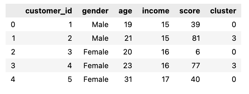
# plot the clusters
import plotly as py
import plotly.graph_objs as go

data = go.Scatter3d(
    x= df_mall.age,
    y= df_mall.score,
    z= df_mall.income,
    mode='markers',
    marker=dict(
        color = df_mall['cluster'],
        opacity=0.8
     )
)

layout = go.Layout(
    title= 'Mall Customer Segments',
    scene = dict(
            xaxis = dict(title='income'),
            yaxis = dict(title='age'),
            zaxis = dict(title='score')
        )
)

fig = go.Figure(data=data, layout=layout)
fig.update_layout(width=800, height=800)
fig.show()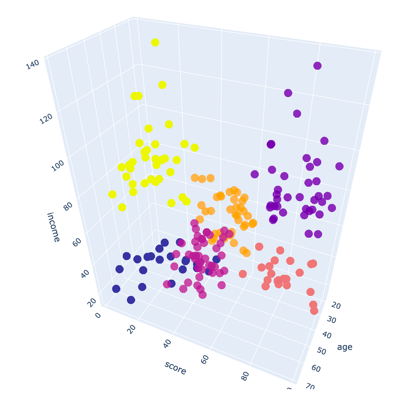
Cluster Prediction
For new data, we can predict its cluster - see how changing one customer’s income level puts him/her into another cluster:
# first customer
df_mall.head(1)
# note the feature order must match the order of the train data
new_customer = pd.DataFrame(
    {
        'income':[60],
        'age': [19],
        'score': [39],
    }
)

# make income from 14 to 60 changed the cluster from 0 to 4
cluster = kmeans.predict(new_customer)
cluster
Plot the different clusters for business insights - customer segment profiling: what’s the differences between the clusters in terms of income, age, and spending scores?
# boxplot for different clusters
fig, ax = plt.subplots(3, 1, figsize=(8,15))
num_features = ['income', 'age', 'score']
for i, feature in enumerate(num_features):
    sns.boxplot(x='cluster', y=feature, data=df_mall, ax=ax[i])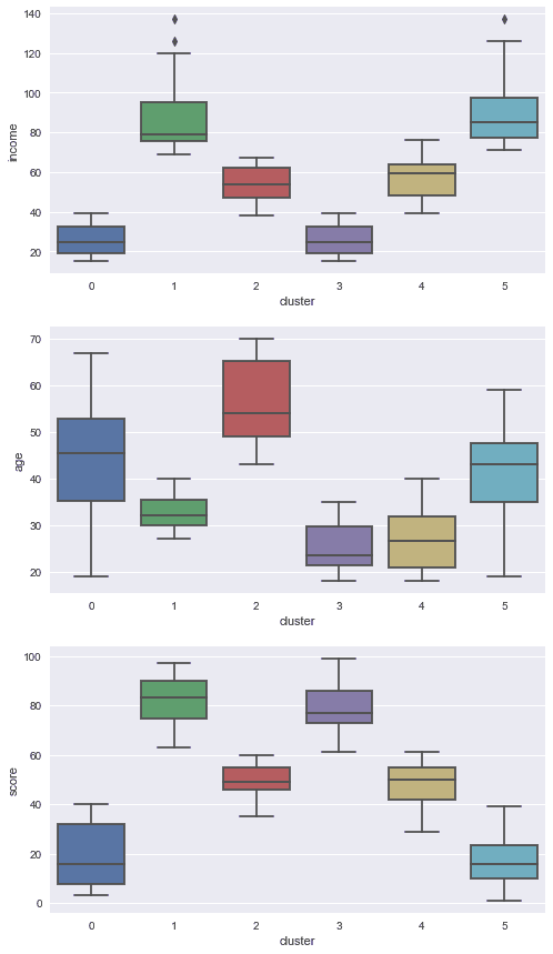
Based on the boxplots above, I give you some examples on how we can interpret clustering results and develop potential strategies:
- customers in cluster 3 are young, low income, but high spending score - what does this mean? high credit card debts?
- customers in cluster 5 are mid-age, high income, but low spending score - what does this mean? What should you do?
- customers in cluster 1 are young, high income, high spending score - what does this mean? VIP customers? What should you do?
RFM (Recency-Frequency-Monetary) Analysis
As another example, I show how to do customer segment based on RFM analysis:
- Recency – How recently did the customer purchase?
- Frequency – How often do they purchase?
- Monetary Value – How much do they spend?
The dataset is revised based on https://archive.ics.uci.edu/ml/datasets/online+retail:
- delete rows with missing values
- remove duplicates
- remove data errors (quantity and unit price <=0)
The dataset includes information about 400k transactions from a UK-based online retail store occurring between 01/12/2010 and 09/12/2011 (about 1.5 years). The company mainly sells unique all-occasion gifts. Many customers of the company are wholesalers.
df = pd.read_csv('online-retail.csv')

# Convert to datetime
df.invoice_date = pd.to_datetime(df.invoice_date)

df.head()
Recency: the number of days since the most recent purchase in the dataset, the smaller the more recent
# Compute recency: the number of days since the most recent purchase, the smaller the more recent
# compute the maximum date to know the last transaction date for the ENTIRE dataset
most_recent_order_date = df.invoice_date.max()

# compute the difference between the most recent order date and each transaction date
# this is the recency for each order - NOT for each customer
df['recency'] = most_recent_order_date - df.invoice_date

# compute the minimal order recency to get the recency for each customer
rfm_r = df.groupby('customer_id')['recency'].min()
rfm_r = rfm_r.reset_index()

# Extract number of days only
rfm_r['recency'] = rfm_r['recency'].dt.days
rfm_r.head()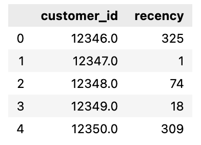
Frequency: count total number of orders:
# compute Frequency: count total number of invoices
rfm_f = df.groupby('customer_id')['invoice_no'].nunique()
rfm_f = rfm_f.reset_index()
rfm_f.columns = ['customer_id', 'frequency']
rfm_f.head()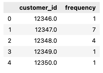
Monetary: compute the total spending per customer
# Compute Monetary: compute the total spending per customer
df['amount'] = df['quantity'] * df['unit_price']
rfm_m = df.groupby('customer_id')['amount'].sum()
rfm_m = rfm_m.reset_index()
rfm_m.head()
Merge the data into one data frame:
# Merge tha dataframes to get the final RFM dataframe
rfm = pd.merge(rfm_r, rfm_f, on='customer_id')
rfm = pd.merge(rfm, rfm_m, on='customer_id')
rfm.columns = ['customer_id', 'recency', 'frequency', 'monetary']
rfm.head()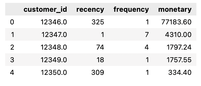
Feature Scaling and Outliers
Given that K-means is distance-based algorithm, it's critical to do feature scaling. We use standardization scaling and use the generated the z-scores to remove outliers.
from sklearn.preprocessing import StandardScaler

scaler = StandardScaler()
rfm_scaled = scaler.fit_transform(rfm[['recency', 'frequency', 'monetary']])

# convert scaling result to a dataframe with proper column names
rfm_scaled = pd.DataFrame(rfm_scaled)
rfm_scaled.columns = ['recency_z', 'frequency_z', 'monetary_z']

# combine with the original dataframe
rfm = pd.concat([rfm, rfm_scaled], axis=1)
rfm.head()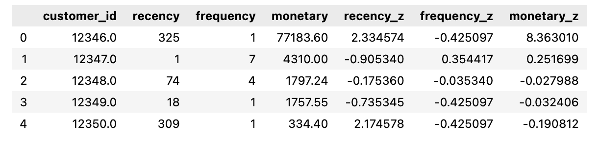
Check potential outliers (so many):
# lots of outliers
rfm[['recency_z', 'frequency_z', 'monetary_z']].plot()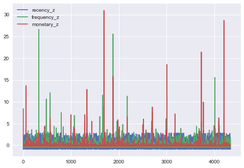
Remove rows with z-score > 3 or < -3:
# remove rows with z-score > 3 or < -3

rfm= rfm[(np.abs(rfm.recency_z)<3) & (np.abs(rfm.frequency_z)<3) & (np.abs(rfm.monetary_z)<3)]

rfm[['recency_z', 'frequency_z', 'monetary_z']].plot()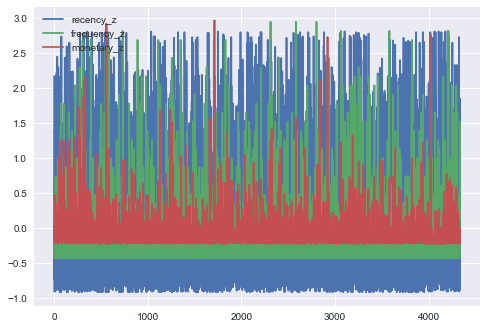
Now, we can use the scaled features to train the k-means clustering algorithm:
# clustering using the scaled features
from sklearn.cluster import KMeans

inertia_scores = []

# try 10 different k values
for k in range(1, 11):
    kmeans = KMeans(n_clusters=k, random_state=42)
    kmeans.fit(rfm[['recency_z', 'frequency_z', 'monetary_z']])  # only used z-scores to train
    inertia_scores.append(kmeans.inertia_) # record the inertia for each k

# plot the inertia
fig, ax = plt.subplots(figsize=(15, 5))
k = np.arange(1, 11)
ax.plot(k, inertia_scores, 'o')
ax.plot(k, inertia_scores, '-')
ax.set_xlabel('Number of Clusters: k')
ax.set_ylabel('Inertia')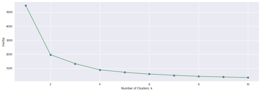
Choose k=4 to train the final model:
# choose k=4 to run k-means again
kmeans = KMeans(n_clusters=4, random_state=42)
kmeans.fit(rfm[['recency_z', 'frequency_z', 'monetary_z']])

# labels indicates which cluster a data instance belongs to
labels = kmeans.labels_
rfm['cluster'] = labels  # create a new column to indicate cluster label
centroids = kmeans.cluster_centers_

rfm.head()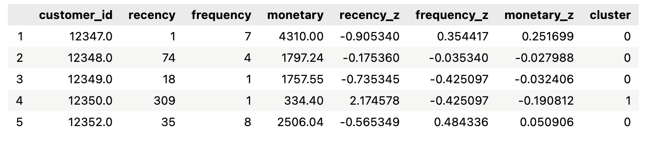
Plot the clusters in 3D:
# plot the clusters
import plotly as py
import plotly.graph_objs as go

data = go.Scatter3d(
    x= rfm['recency_z'],
    y= rfm['frequency_z'],
    z= rfm['monetary_z'],
    mode='markers',
    marker=dict(
        color = rfm['cluster'],
        line=dict(
            color= rfm['cluster'],
            width= 12
        ),
        opacity=0.8
     )
)

layout = go.Layout(
    title= 'RFM Customer Segments',
    scene = dict(
            xaxis = dict(title='recency'),
            yaxis = dict(title='Frequency'),
            zaxis = dict(title='monetary')
        )
)

fig = go.Figure(data=data, layout=layout)
fig.update_layout(width=800, height=800)
fig.show()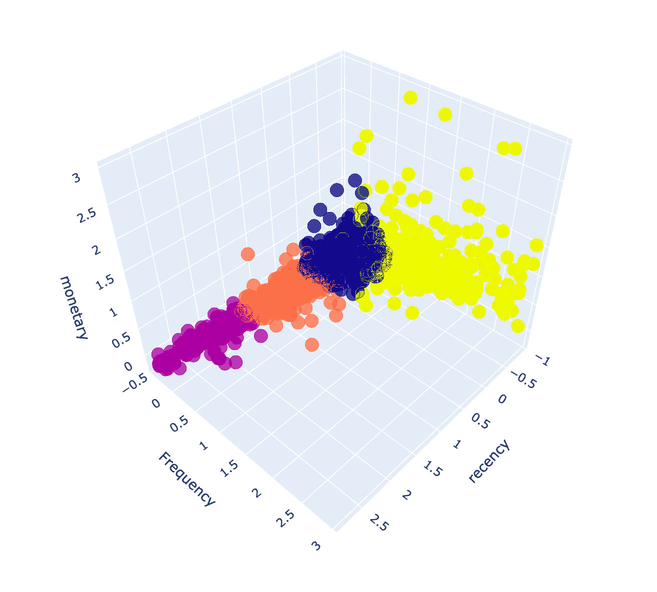
Plot the different clusters for business insights - customer segment profiling: what’s the differences between the clusters in terms of RFM?
# boxplot for different clusters
fig, ax = plt.subplots(3, 1, figsize=(8,15))

features = ['recency', 'frequency', 'monetary']
for i, val in enumerate(features):
    sns.boxplot(x='cluster', y=val, data=rfm, ax=ax[i])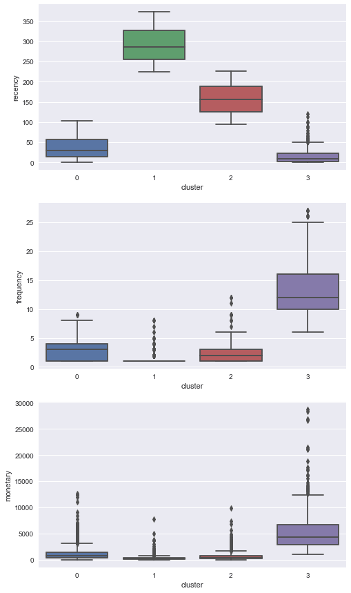
Based on the box plots above, we can have some basic business interpretations and potential strategies:
- customers in cluster 2 are the sleeping buyers with low frequency and OK total transactions amount but have not purchase anything for 150 days - study the categories of the products and try to "wake up" them.
- customers in cluster 3 are the frequent buyers with large total amount who bought from the store recently - send out coupons and even call the extreme VIP customers to provide VIP service to make they purchase again and more.
- What’s about cluster 0?